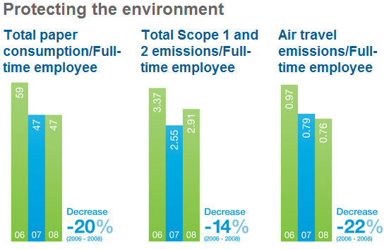
I saw these couple of charts from the Standard Chartered Bank website.
Things I like about it:
- Fresh colour scheme. Blues and greens work well together.
- Bold titles that explain the intentions of each chart.
- Each chart has an Increase/Decrease call out to emphasize the conclusion from the data trend.
- Overall it’s a format that is pleasing to the eyes and easy to understand. Great job!

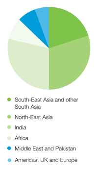
I hate pie charts for many reasons. But in this case, this particular pie tastes pretty good for the following reasons:
- It looks pretty. Very nice color scheme . The green & blue hues fits nicely like Lego blocks.
- Sorted and group slices with the biggest slices at the bottom. I can easily make out which slices are bigger.
- I don’t feel confused. This pie chart uses only 6 slices which I can mentally organize in my head.
- Overall clarity is well maintained with the skillful use of color, slice size sorting and small number of slices.

About Aeternus Consulting
Related Link: Aeternus Consulting Excel Training Courses Singapore
Aeternus Consulting offers an excellent workshop Storytelling with Data Visualization using Beautiful Excel Charts. This workshop is aimed at students visualizing thesis data, managers and analysts needing to communicate in a data-driven way and leaders informing their board to drive actions.
Related Link: Making Charts Beautiful with Microsoft Excel


