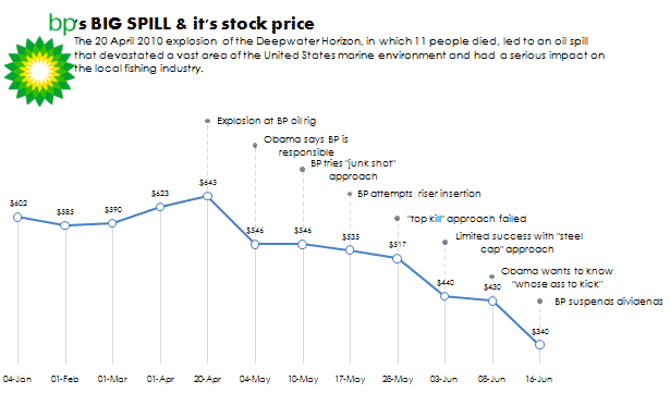
On 20 April 2010, a BP oil well exploded in the Gulf of Mexico, causing the largest offshore spill in U.S. history. This Microsoft Excel line chart illustrates some key events 2 months after the explosion and BP’s stock price using a common Date horizontal axis.
The resulting chart is rich in information yet it’s not cluttered. The key relationship between stock price, event and dates are tied up using the “Lollipop Approach” described earlier.
See the full pic:

reference: http://en.wikipedia.org/wiki/Deepwater_Horizon_oil_spill.
About Aeternus Consulting
Related Link: Aeternus Consulting Excel Training Courses Singapore
Aeternus Consulting offers an excellent workshop Storytelling with Data Visualization using Beautiful Excel Charts. This workshop is aimed at students visualizing thesis data, managers and analysts needing to communicate in a data-driven way and leaders informing their board to drive actions.
Related Link: Making Charts Beautiful with Microsoft Excel


