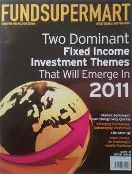
FundSuperMart is a Singapore produced magazine covering investment insights and trends on mutual funds. I picked up a copy at a 7-11 store and thumbed it through. I liked the articles. They appear thoughtfully written and are supported by charts.
The glaring problem is every chart looked amateurish. I have the feeling they were created by some 2nd year college student from an engineering faculty. It’s hard to have kind words when I see charts like these:

Axis labels that are bigger than the columns in the chart! What a waste of editorial space for nothing of value.

This is worse. The combined space for the labels and legend is bigger than the chart itself. They could have devoted the space to comment on the trend instead.

It’s obvious the magazine is fond of using legends and coloured lines. But it adds clutter and makes me seasick constantly having to flit my eyes between the legend and the line charts.

Florescence green, lime green and purple. This chart is more colourful than a bag of M&Ms. This magazine does not have a consistent visual style for charts which IMO adds clutter and confusion to the reader.

Pie charts with too many slices cannot show distinct distribution patterns. Charts that do not have strong messages are pointless!

At the last page there is an infographic that tries to present some global population facts. I got lost after Gender…
Frankly, I can’t take this magazine seriously like a Bloomberg publication if they continue to produce slipshod charts like these.
About Aeternus Consulting
Aeternus Consulting is a Microsoft Office consultancy and & digital creative agency. We specialise in Microsoft Office training, VBA application development, Business modeling in Excel, infographic designs, data visualizations and web UX UI.
Related Link: Aeternus Consulting Singapore


