Singapore General Election Results 2011 in an Excel Chart

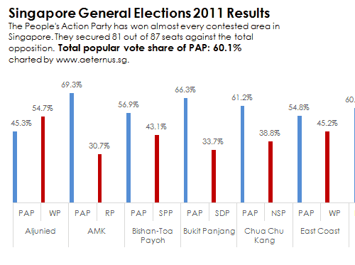
This is an Excel chart to summarise the latest election results of Singapore. The People's Action Party has won almost every contested area in Singapore.
Vote

This is an Excel chart to summarise the latest election results of Singapore. The People’s Action Party has won almost every contested area in Singapore. They secured 81 out of 87 seats against the total opposition.  Total popular vote share of PAP: 60.1%
Click to see the full pic:

Download an animated PowerPoint version here.

About Aeternus Consulting

Related Link: Aeternus Consulting Excel Training Courses Singapore

Aeternus Consulting offers an excellent workshop Storytelling with Data Visualization using Beautiful Excel Charts. This workshop is aimed at students visualizing thesis data, managers and analysts needing to communicate in a data-driven way and leaders informing their board to drive actions.

Related Link: Making Charts Beautiful with Microsoft Excel

excel courses in singapore
Advanced Excel Training Courses Classes Singapore: making beautiful charts

3 Responses

  1. Hello,
    I was browsing along several excel consultancy forums when I saw this chart. While certainly interesting, I can’t help but comment on what I could see to be several questionable design elements to this chart, especially coming from a design consultancy company. Specifically:

    1. Chart Type – why a clustered chart instead of a stacked chart when there are only clearly two parties? I was halfway into copying the data when I realized that the total sum for each is 100%, and I also question why a 100% stacked chart wasn’t used in the first place.
    2. Orientation – Placing the values on the x-axis is an inefficient use of space, leading to a horizontal chart that spans several PowerPoint slides.
    3. Placement of Data Bar base – At first, I wondered why the data bars were on the tick marks instead of on them; I later saw that it’s staggered, with the base moving from left to center to right.
    3. Arrangement – The reader would be more interested to figure out which areas have strong PAP vs WPP percentages; in this light, I would have arranged the data in descending order instead of alphabetically.
    4. Listing of data values – A supplementary table would be better to show the exact data values instead of putting them all on each point. The current arrangement stretches the table too much and makes getting any form of meaningful conclusion difficult.

    In light of this, I have attached my take on the chart on the link below. The format makes it compact, and the gridlines at + and -50% allow the user to clearly see that SPP only won in one of the 26 locations.

    http://i613.photobucket.com/albums/tt217/noyahuid/SGElectionChart.jpg

    My reaction is more of surprise than anything, so kindly take no offense at my comments – though I can say that I am eagerly waiting a response.

    Best Regards,
    James C. Lee

    1. Hello James

      I love the work you did on the chart. It’s a tight and efficient tornado chart. This is a good format to show a “me” against “them” story in a compact space. For my interpretation of the data, I deliberately chose a large format because space was not a concern. I wanted to the reader to take the time to pan across the chart, study each GRC in detail and perhaps reflect on their personal choices that created this political landscape.

      warm regards
      CH

Leave a Reply

Your email address will not be published. Required fields are marked *