A gallery of Beautiful Charts for Excel part 2

have scoured the web and magazines for beautiful charts designs that we can use in our Excel reports. This is part 2 of a gallery I am creating.
Gallery

I have scoured the web and magazines for beautiful charts designs that we can use in our Excel reports. This will be part of a gallery I am creating. Do visit this blog for regular updates.

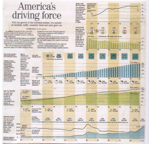
Intelligent chart layout makes it look good.
I love the use of coloured bands to give a sense of passing time.
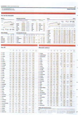
3 simple red bands gave this mess of numbers and charts structure.!
3 simple red bands give this mess of numbers and charts structure.!

About Aeternus Consulting

Related Link: Aeternus Consulting Excel Training Courses Singapore

Aeternus Consulting offers an excellent workshop Storytelling with Data Visualization using Beautiful Excel Charts. This workshop is aimed at students visualizing thesis data, managers and analysts needing to communicate in a data-driven way and leaders informing their board to drive actions.

Related Link: Making Charts Beautiful with Microsoft Excel

excel courses in singapore
Advanced Excel Training Courses Classes Singapore: making beautiful charts

Leave a Reply

Your email address will not be published. Required fields are marked *