
This is an alternative interpretation of my previous Excel chart on the 2011 Singapore General Election results by James C Lee.

Below was my original version in a previous post.
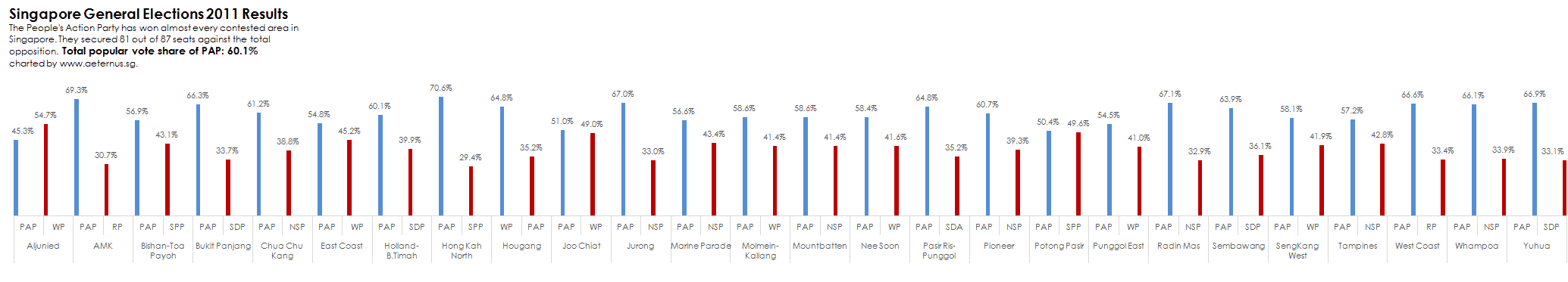
In many ways, it is a better version compared to mine. The tight Excel chart was able to show with clarity specific election results between the People’s Action Party with the various opposition in all 26 constituencies. The colour used in the chart was in sync with the chart title which enhanced clarity. The best part of this chart was at a glance, it could tell which side was the clear winner, and when studied in detail each row was a blow by blow account of the election results.
About Aeternus Consulting
Related Link: Aeternus Consulting Excel Training Courses Singapore
Aeternus Consulting offers an excellent workshop Storytelling with Data Visualization using Beautiful Excel Charts. This workshop is aimed at students visualizing thesis data, managers and analysts needing to communicate in a data-driven way and leaders informing their board to drive actions.
Related Link: Making Charts Beautiful with Microsoft Excel