Quoting from my favourite marketer Seth Godin:
The only way to succeed is to be remarkable, to be talked about.
Seth Godin
So I was really amused that Peltier Tech picked up on my past article “Ugly Real Economic Growth Chart from Singapore Statistics” and was inspired to write another. Good ideas do travel.
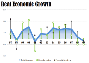
I made certain aesthetics changes to an original chart from Singapore Statistics.
Some modest changes and this was created:
What irked me was that the author proposed charts that had everything I hate about Excel charts.
He merely recoloured the original ugly chart! Compare and see for yourself.
I always wanted to combine business aesthetics and business savvy in Excel charts.
In my latest workshop Making Beautiful Excel Charts I will break all the traditional rules in Excel charting. What you get are designer-quality charting ideas with Excel.
That being said, I whipped up another version. Without be-labouring the point, the results are obvious for everyone to see.
Let me end this with Seth Godin’s words again:
The new Dream that markets around the world are embracing is this:
- Be Remarkable
- Be generous
- Create Art
- Make Judgement calls
- Connect people to new ideas
and we have no choice but to reward you.
About Aeternus Consulting
Related Link: Aeternus Consulting Excel Training Courses Singapore
Aeternus Consulting offers an excellent workshop Storytelling with Data Visualization using Beautiful Excel Charts. This workshop is aimed at students visualizing thesis data, managers and analysts needing to communicate in a data-driven way and leaders informing their board to drive actions.
Related Link: Making Charts Beautiful with Microsoft Excel


