Have you ever told yourself that creating great looking Excel charts is hard? Well it’s not. You only need to understand the only reason we create charts is to aid comprehension of a trend. Once you understand this, you can start to create charts that’s easier to read and understand than text!
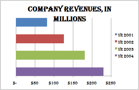
First, this is not a good way to design effective charts. There is unnecessary clutter with too many colours, complex font and a legend that needs mental processing by the reader.
The basic way to create beautiful and effective charts in Excel is to remove everything that is superfluous. I took this idea to the extreme and designed a minimalist chart with the same data. By removing clutter, clarity is enhanced!

About Aeternus Consulting
Related Link: Aeternus Consulting Excel Training Courses Singapore
Aeternus Consulting offers an excellent workshop Storytelling with Data Visualization using Beautiful Excel Charts. This workshop is aimed at students visualizing thesis data, managers and analysts needing to communicate in a data-driven way and leaders informing their board to drive actions.
Related Link: Making Charts Beautiful with Microsoft Excel