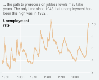
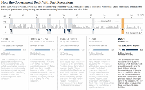
The New York Times has the best illustrated charts I have ever seen. They are visually clear, easy to understand with good copy writing to explain the message behind a story. Note the use of blues and orange shades to give visual contrasts.


About Aeternus Consulting
Related Link: Aeternus Consulting Excel Training Courses Singapore
Aeternus Consulting offers an excellent workshop Storytelling with Data Visualization using Beautiful Excel Charts. This workshop is aimed at students visualizing thesis data, managers and analysts needing to communicate in a data-driven way and leaders informing their board to drive actions.
Related Link: Making Charts Beautiful with Microsoft Excel


