
I came across this stock chart in the Kuala Lumpur’s edition of the Business Times while I was in Malaysia. The chart has an elegant treatment of dates. I have seen this sort of designs in many magazines and wanted an afternoon challenge to do this in Excel.
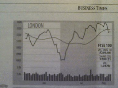
It uses alternating blocks in the plot area to indicate passing months.
The exercise wasn’t very challenging after all. I managed to capture the nice features of the original chart. To create the clean horizontal date axis, I used a column with the formula “=IF(DAY(A2)=1,A2,””)“. This formula only displays a date if it is the 1st day of the month.
The alternating month blocks was created with an area chart using a column of formulas like this: “=IF(MOD(MONTH(A2),2),3000,NA())“. This creates a pulse train that varies between 0 and 3000 across months.

About Aeternus Consulting
Related Link: Aeternus Consulting Excel Training Courses Singapore
Aeternus Consulting offers an excellent workshop Storytelling with Data Visualization using Beautiful Excel Charts. This workshop is aimed at students visualizing thesis data, managers and analysts needing to communicate in a data-driven way and leaders informing their board to drive actions.
Related Link: Making Charts Beautiful with Microsoft Excel